

With the majority of Internet browsing taking place on mobile devices it’s more important than ever to ensure your website looks great on all kinds of devices. The only way to truly test this is by getting your hands on the devices. With so many devices on the market, how do you ensure all your visitors have a great experience?
Focus on the most popular devices
h
There are hundreds of devices in use today in a variety of sizes and operating systems. Narrow your testing down to the top 3-5 devices. Which ones should you focus on? Check out StatCounter for information on the popular mobile operating systems, manufacturers and screen resolutions. This should help you narrow down the list of devices you need to test on.
Recruit your friends
Small businesses often rely on their employees, friends and family to help them test their site on a variety of devices. Keep an eye on the devices your friends and family own and consider recruiting a few to give your site a test. Obviously this isn’t a long term solution but it might help you test some of the less popular models.
Emulators
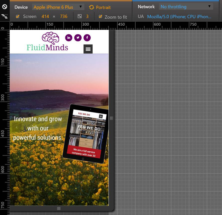
A mobile device emulator lets you test the functionality and responsiveness of your website without owning each device. My favorite method for doing this is using the Google Chrome Browser which allows you to simulate your site on various devices. I find these emulators to be reliable in running device specific code at the appropriate times where a lot of emulators simply emulate the screen resolution.
Here’s how it works:
- Open your website in Google Chrome.
- Click the Chrome Settings menu.

- Click More Tools >> Developer Tools.
- Click the device icon in the developer toolbar.

- Using the Device toolbar, select the device.
- Refresh (F5) your website to ensure it is displayed properly.

What should you test?
Is it fast? Mobile users are the most impatient of Internet users. If the site doesn’t load fast, they move onto something else. Use the Network throttle settings in the emulator to simulate slower networks and see how your site responds.
Are the images cut off? With a variety of screen sizes available, be sure to verify images are resizing to the screen.
Do all the menus and links work? Interact with the site. You should not need to zoom or pan to get to menus or links. The site should be easy to read and digest on any device.
Be sure to test each device in portrait and landscape mode!